I agree that it would be easy just to throw a picture of the module up, but I’m also saying it’s usually common sense to check out the wiring diagram of a piece of electrical equipment to check if it will work on your circuit before purchasing. I don’t think that’s an “excuse”.
Yes, if you want to dive into the details of the install. Finding the basic requirements to be able to use it such as a switch box with line and neutral present and a fan box with live and neutral should not require looking in the manual.
It definitely shouldn’t be necessary to look at the manual to find out there is a canopy module.
Or, you know, the basics.
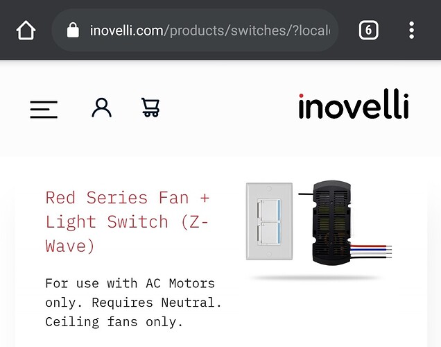
The product page on the Products list has a canopy module displayed:
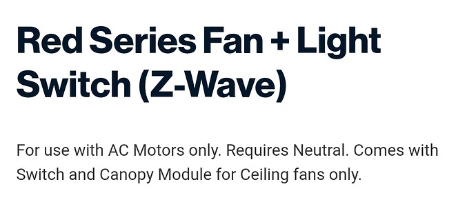
The product page says canopy module (may be new):
And many reviews mention the canopy module.
Agree. There is plenty of information clearly available. The cover image showing the canopy is a nice adder, but no other changes would really add more value, just duplicated information.
If you hover over the picture on the Products page, not the specific product page. You can easily get to the product page without seeing that.
Your picture is showing a new change. The text used to read “For use with AC Motors only. Requires Neutral. Ceiling fans only.” No mention of the module.
There’s a lot of fanboy like excuses being given. You don’t blame a customer for not being able to understand basics about the product by saying they needed to research and dig out the information because it’s there if you try hard enough to find it. You make the marketing clearer. The product page lacking the information is a marketing problem, period. It certainly doesn’t need to be that way.
It looks like Courtney has since added a note about it being 2-parts with a canopy module, a step in the right direction. I suspect she’ll add more when she can.
Honestly, I find other product pages to be off too. For example, on the red dimmer page the text saying it has notifications could be alongside an LED strip animation illustrating what a notification looks like. Point to the config button on a switch when describing how it can be configured locally. Have a switch with the bar flashing green when describing the signal strength test. Instead of the exploded view (Which looks cool but doesn’t really help anything) do this stuff with the animation changing as you scroll. The notifications could change as examples are given too. I guess I just think that exploding animation is such a waste compared to what could be done with animations.
I guess I started a thing here.  Just for the record I really like the rest of my Inovelli products. It’s been a learning experience for sure as a newbie to the z-wave/zigbee scene, but I’m glad I went with these switches. Inovelli made it right regardless of who was at fault, I sent it back, they gave me my money back, all is good! My original post was born out of confusion and mass hysteria I think, but I did want to make a suggestion that the product pages could use a little updating which it looks like is being done. I only suggested it to save the next person that might make the same mistake. For those of you that like to read product manuals and schematics before clicking Buy Now, more power to ya, but I have no intentions of adopting that life style any time soon. Anyways, thanks Inovelli, the return process was pretty painless and I can’t always say that about Internet Direct companies.
My screenshot was of the “Products” page, on mobile. That image should also be on the specific product page though, yes.
I said that it was new.
Me agreeing that it can be clearer but also trying to show that the information is there is not a fanboy excuse.
OP asked what they missed, I was trying to show that the information was there and that they missed it. Is it super easy to find? No. It is there? Yes. The information is also in other marketing materials like their YouTube channel. Not really trying to fight with you here, was just trying to show OP where the information was.

