Inovelli 2.0 Website Optimization - Looking for Feedback

Hey everyone – now that we’ve launched Inovelli 2.0 it’s time to optimize this bad boy and make it easier for everyone to find things.

Over the next couple of months, @Courtney_Inovelli, @anon14959390, @Brianna_Inovelli, @EricM_Inovelli and I are going to work on the overall user experience. There will be a lot that goes on behind the scenes from a logistics/inventory side that won’t really matter to you all, but it will help us be better at showing in-stock items for Canada vs USA. But more importantly, we want to make sure that when someone comes to the site, they can easily find what they want and fast.

This thread is for an open discussion on what you’d like to see improved with the site (be it bugs or enhancements).

In my opinion, there are three reasons why you go to a website:

  1. Learn
  2. Purchase
  3. Communicate

Learn

There are three places that will be (or are already) created where you can find information:

The KB & Community are typically for people that already know about us and are looking for help, whereas the Smart Home 101 section will be more of a spot where people who haven’t heard of us and are looking for a place to learn about what a smart home is and what can be done.

  • KB = a place to go for Installation Instructions, How-To’s, drivers/handlers, manuals, etc.
  • Community = a place to go for help, see what’s new, and connect with others
  • SH 101 = will be a place to go that takes you across the entire journey of owning a smart home (beginner, intermediate, advanced) and it will be a place where we walk you through our lives a bit. More of a place for people to learn at any stage

Enhancements:

  • Search to include both KB & Community threads (this has to be specialty coded bc it was two different platforms)
  • Proper Tagging of articles and Community Threads
  • Proper Organization of Community – I think I’ve done this by breaking up the community into sub-communities (ie: Hubitat, ST, HA etc) and a separate section for Wiring Discussions, but open to feedback for sure if it’s not working
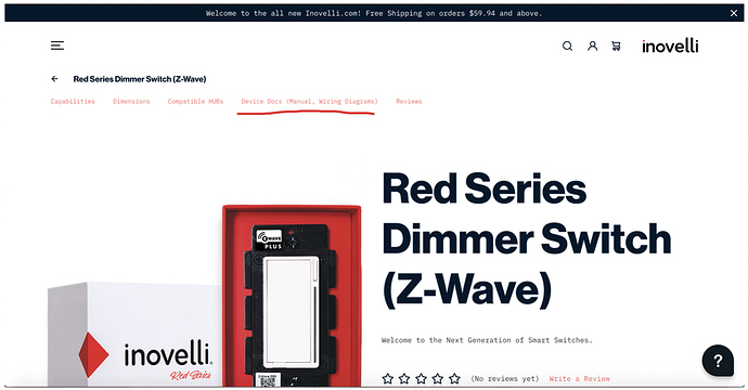
  • Easy access to essential docs such as Manuals, Wiring Diagrams, etc

Purchase
Not much to say here other than products should be easy to find and easily digestible. One of the issues we struggle with is that our products have a ton of features. How do we relay this message to people who are starting out?

Enhancements:

  • Single Sign-On
  • USA vs Canada Inventory (show out of stock if not in stock in one of the markets)
  • Hub Compatibility Warning (purchase something that’s not fully compatible a warning will appear before you purchase)

Communicate
An easy way to reach us and communicate with either us or the community to get issues resolved.

We recently upgraded our helpdesk system that actually made things much easier to respond to tickets (now we just need more staff lol) and ultimately hopefully improved user experience as you can now log-in to see the status of your ticket(s), etc.

Enhancements:

  • Single Sign-On
  • Auto-emails that are hub specific that hopefully answer your question(s) or at least point you in the right direction
  • Once there’s more staff, we can turn on Live-Chat which is built into our help-desk

Running list of optimizations/enhancements/bugs:

  • Search in Forum and Site to include both KB & Community threads (this has to be specialty coded bc it was two different platforms)
    • Forum Search
    • Help Button Search (little blob at the bottom left of Inovelli.com) – In Progress
    • Search bar at the top of the website
  • Proper Tagging of articles and Community Threads
  • Proper Organization of Community – Done, but open to feedback
  • Easy access to essential docs such as Manuals, Wiring Diagrams, etc
    • Put link on top of product pages - Done
    • Easily searchable in search bars
  • Single Sign-On across all three logins (KB, Inovelli, Forum)
  • USA vs Canada Inventory (show out of stock if not in stock in one of the markets)
  • Hub Compatibility Warning (purchase something that’s not fully compatible a warning will appear before you purchase)
  • Auto-emails that are hub specific that hopefully answer your question(s) or at least point you in the right direction
  • Once there’s more staff, we can turn on Live-Chat which is built into our help-desk

Looking forward to hearing from you guys and adding to our running list!

2 Likes

I’d consider bringing back direct links to wiring diagrams on the product page (and possibly additional direct links to applicable knowledge base articles). When the site was revamped, I couldn’t find the diagrams for a while.

My thinking is someone searches on google “inovelli red series dimmer wiring” the first result brings them to the product page which the information can’t be found on. Next link brings them to the community page that links to the KB page.

Edit: I do like the new look, and having the official knowledge base centralized is convenient.

4 Likes

I like the new website :+1: I think it would be nice having a direct link to the newest device handlers in the front page of the support section, in my opinion.
2 Likes

Excellent idea – I just added this to the product pages, thank you for the suggestion!

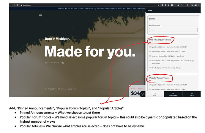
Yeah, great idea – let me see what I can do here. The problem is that the KB is tough to skin from what I’m told. But, it would be nice to have something next to where it says, “Popular Articles” or something.

What we are doing (should roll out tomorrow or Thurs) is creating a, “Popular Articles” section in the little, (?) bubble at the bottom left and we can put them there too:

3 Likes

Actually I have one that I ran into yesterday…

For Learn- it’s too hard to find actual documentation (manuals). As an advanced user I do not need a step by step hand-holding, I just need to know what button to push to trigger include mode, and what the parameters are and do. For that I want the manual, like the one that came in the box.

Right now the support page has two main areas- knowledge base, and tickets. There should be a 3rd area- documentation. Even if it’s just a link to a category within the knowledge base. That would have the spec sheets and manuals for the devices.


More broadly- the site I think has a bit too much ‘trendy new design’ and that reduces the content delivery to the user.
Take the front page. Studies have shown that people form their initial opinion of a site within 1/4 of a second of the page loading. So you have an opportunity to (through design, text, images, etc) convey one concept to the user in that 1/4 second. Right now it’s ‘born in Michigan made for you’. That’s nice but it doesn’t really mean anything, especially with the fairly generic image behind it. That image IMHO should be like a pair of Inovelli Red switches in a screwless double gang plate, and ‘smart products to enhance your home’ should be front and center.
The video is also a great ad, but it can be enhanced as well. Right now parts of the video target well at automation nerds- ‘stay in the know with custom notifications’ and ‘scene control’ are terms that people like us go ‘oohhh it can do doubletap scene triggers!’ but someone not as familiar with HA might not understand. Maybe have on half the screen a door or garage door being opened, and on the other half the Inovelli switch goes from green to red. You should also add in the dimmer switch with it’s more expressive light bar.

Something like this could make a good background video for the website. IE, show that double gang switch with the two Inovelli switches, then also show a garage door being opened or something similar, and the switches change color. That IMHO is a real selling point that you should be pushing- the switches don’t just control your lights, they can show you what’s going on in other parts of the house.

Back on the idea of being too ‘new design-’ there are a few places where fancy parallax scrolling take away from page content. For example on the front page, it feels like you have to scroll through a LOT to get through the three dimmer pages of text.
And the hamburger menu in the top left- why does it need to take up the ENTIRE screen? I don’t like that. It should only be a pop out menu, that goes BELOW the top navbar so the Inovelli brand at the top right and the quick icons (search, user, cart) are always visible.

Also, IMHO anywhere your products are listed, the flagship product (Red series dimmer) should always come first. Right now on the front page I see Black on/off, 4-in-1 sensor, and black dimmer.

And on the front page- Introducing Red series dimmer should be up at the very top or just under the first page, NOT below some ‘buy now’ links. That’s your flagship product, the thing you want to sell people, don’t hide it 3 pages down.

Anyway that’s just some thoughts for the moment. Hope it helps.

3 Likes

Thanks, this is actually super helpful! I appreciate you taking the time to write up about it :slight_smile:

Definitely something we can try to optimize. From what I was told, the Support page is tricky to format bc it’s using Zoho’s back-end and there’s not a lot of formatting that can be done. However, the agency that built our site wasn’t that familiar with Zoho, so they may just not have looked too much into it and since it was kind of out of scope, I’m sure not a ton of time was spent here, so I can ask an expert on this bc I agree, it’s a little cluttered. We would like distinct areas (spot for manuals, drivers, etc on the main page).

For the second half of your email – I think internally we all agree here for sure and we’ll be optimizing this over the next few months. The part we struggled with internally was that I’m not convinced the agency really understood what smart homes could do and since this was the 3rd agency we used and it was going on almost 2yrs at this point, we just said, “get us something to work with that’s clean and more organized”. The part that was a little discouraging was that we upgraded our back-end platform (WooCommerce to now BigCommerce – long story short, it tied in better with our multi-channel fulfillment platform) but there wasn’t a ton of BC agencies out there that knew how to build a nice looking site on BC.

These guys made a nice site, but amidst their PM leaving and the site being in limbo for a few months, we just said, “ok, let’s just move forward with the current design”. The other aspect was budget – this thing was already astronomical without adding a fancy photoshoot to it.

The site that we really like (and surprisingly the agency that built ours also built theirs) is Skullcandy. I think they do an excellent job with what your pushing. They make headphones look sexy.

Long story short, I (and I believe the team) agrees with the direction you’re pushing and I think you’ll see our marketing material and emails reflect that shortly.

So, I think the next steps for us is to optimize what we have and then for the next iteration, use the current sites bones to add in better photography.

Anyway, thanks again for that feedback, it’s definitely good to hear what we’ve been trying to echo internally for a while!

3 Likes

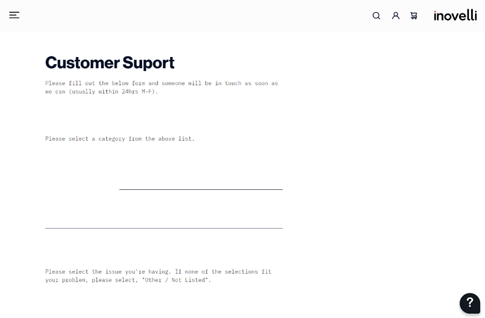
Your contact us page is a bit wonky.

The form fields and dropdowns aren’t clear forcing one hunt around for what is supposed to be happening.

The “New User” form has jumbled field names. https://imgur.com/a/NrrzZwB

Also, if we had an account on the old website, were the logins transferred? I couldn’t get logged in.

I am a brand new user to Inovelli and I have to admin it’s not very user friendly at all, LOVE the build quality of the device itself. For background I would rate myself a 5/10 for this kind of stuff, my house is outfitted with Ring alarm/lights, Yale Locks, TP-Link Switches, plugs, and I’ve installed all of this myself.

The installation manual from a technical perspective is pretty good, however it’s trouble some when navigating. Hard to find things and it’s cumbersome. That’s my experience with the red dimmer switch.

I have a hard time knowing/finding information on what the LED blinks mean after I hit the on or off button. I have no idea what it means when the light blinks Red/Green/Blue after I try to turn on the switch. A trouble shooting section in the manual would be great.

I realize that you have your own use case, but it would be nice to have an application that can help you navigate installation and troubleshooting. A simple repository that could tell you everything you need to know from setting new parameters on the device to what the RGB indicators mean.

Hope this is helpful. :slight_smile:

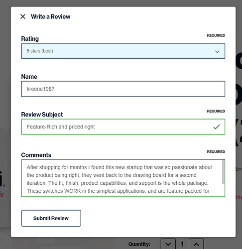
Tried to leave a review per an email I got on the unboxed red dimmers and it just sticks open and doesn’t “submit” and close the window:

Submit does nothing.

Awesome, thank you – we had some issues with our backend desk solution (Zoho) integrating properly with our BigCommerce (front end) theme, so we just redirected this to go straight to our Zoho support desk page.

Thank you – yes, this was actually related to some work we were doing on the bubble at the bottom right of the screen (the help bubble) – it should be fixed now.

As for the old accounts, we’re still working on figuring out how to merge our old platform (WooCommerce) with our new platform (BigCommerce). It’s been put on hold for a bit bc we’re working on SSO (Single-Sign-On) and rather than resetting everyone’s passwords from the old site and then asking them to do it again when SSO launches, we’re going to do it one time when SSO launches (should be first week in June).

I apologize for this – it was something the agency was supposed to do when building the website, but was more complicated than what was in scope. Your data should all be there in the first couple weeks of June (order history).

Super helpful, thank you! I’ll keep this in mind as I re-design the tutorial pages. I think the ones currently served more as a, “let’s get something out there now and then improve them as feedback comes back” so this is good to know!

Welcome to the community and thanks for the support!

This should be fixed now – there was an issue regarding the bubble again (that pesky little help button at the bottom right of the page) that seems to be affecting various portions of the site.

Submitted a review, hopefully you see it on your end.

1 Like

@nismos14 – I wanted to keep you posted on this part:

I added some GIF’s to the tutorial page (I’ll be uploading them to the other pages shortly), curious on what you think?

Maybe there’s a dedicated page to the various LED colors, I’m not sure.

Here’s an example of the GIF’s

Thanks for again for your input :slight_smile:

Thanks! I’ll take a look :slight_smile:

EDIT: Found it – thanks @kreene1987!! That really means a lot.

@Eric_Inovelli this is outstanding!

I would add to have this type of information and installation instructions in either an application of your own or having it in an app such as BILT (used by Yale Locks/Assa Abloy) could be helpful. While sometimes it’s convenient to have a computer or laptop handy and mostly is needed for device handlers, etc/ customization, it would be nice to be able to quickly reference from your phone all of this awesome detail especially including the GIF’s.

Great job, and I appreciate the action taken on the feedback received!!

This is actually really cool – I’ve never heard of this app before!

Device Page: 4-in-1 Sensor

Clicking on bookmark doesn’t necessarily go to the right spot on the page:
Description --> Description
Compatible Hubs – > Dimensions
Device Manual & Mods --> Compatible Hubs
Reviews --> Reviews

If dimensions is not a tab spot, I think it would be right.

I was looking at your product page for the switches.

That header is wasting a whole lot of screen space. So think about shrinking that down to about half the height it is currently and putting a box under it showing the black and the red switches with a short description to tell the viewer the difference. Link these to the section anchors described next.

Then down further for the list of products, group the black switches and red switches under their own header with page anchors for each section.

One other thing. It would be nice if the top level hamburger menu drop down would disappear on larger monitors 900px or larger.

In the mobile Community forum (not sure on desktop) I wish there was a way to view orders without going to one of the products pages and signing in.

/blog/
There is no rss feed for you blog? I want to subscribe to your blog via feedly.com, but with no rss, there is no happiness.

1 Like

Dang, just seeing this – we’ll get this fixed, thank you for point it out!

I couldn’t agree more – absolutely hate this header lol. The old home page did the same thing – at least now it’s a little more techy looking as opposed to the brown/tan house that was bland.

Yeah let me think on that a bit – we do get a lot of people who wonder what the difference between the Black and Red Series are so this may be a good solution for sure.

Could you elaborate a bit more here?

Interesting – we may be able to do that integration. Where would you like to view them? With Single-Sign-On, you should automatically be able to click sign-in on your Inovelli website account it will automatically sign you in if you’re signed into the community. But we can also see about some sort of integration into the forum.

We’ll work on this, I promise!

1 Like